You want a garden that feels calm and premium, but the colors fight each other in your Malaysia terrace home or condo balcony. Walls, pots, and greens look fine alone, then clash together.
Hot sun, humid air, and sudden rain also change how colors read, so “nice beige” can look dirty and “fresh white” can look harsh. Small spaces make every mismatch louder.
In this guide, you’ll learn how to match garden colors for balance so your plants look intentional, your pots look expensive, and the whole space feels easier to maintain in Malaysia weather.
Hi, I’m Ken. I write practical home guides for Malaysia—no fluff, just what works.
I hold a formal building design qualification and have spent about 20 years on job sites across hundreds of projects. My goal is simple: help you avoid costly mistakes with clear, safe steps—a quick way to decide what to do next.
1. Color-plan garden design: 5 tips
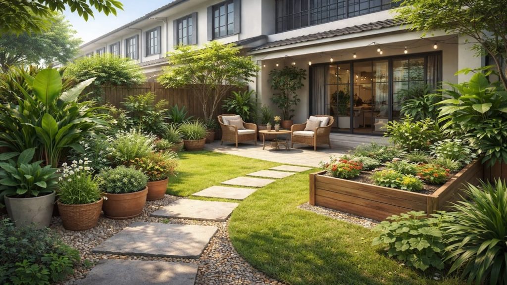
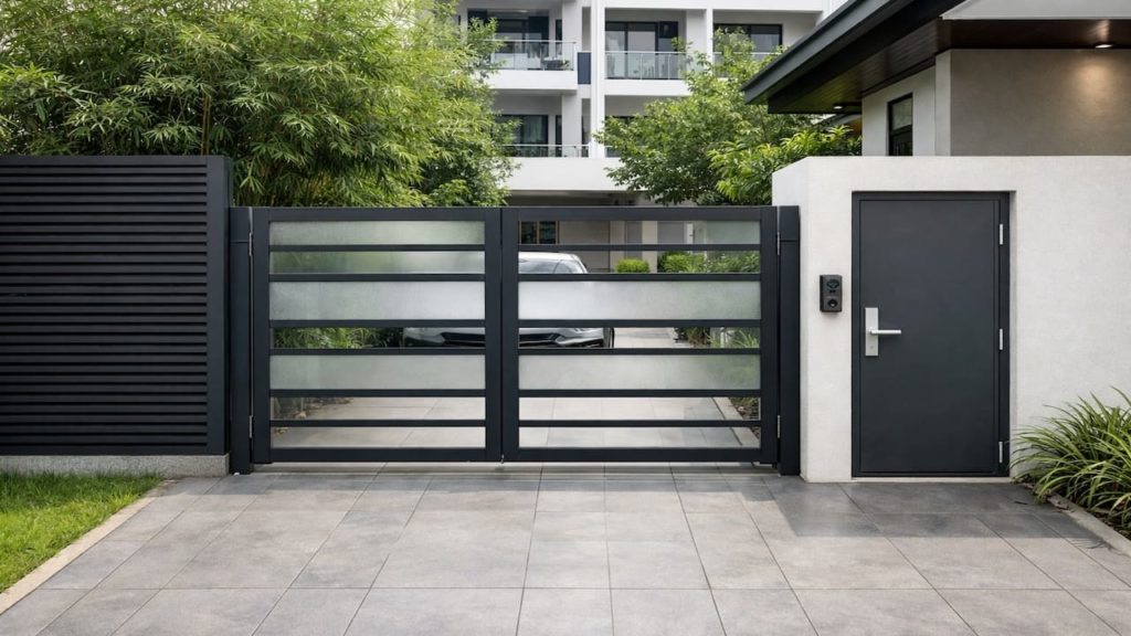
The fastest upgrade is pick one calm base color then build around it so your garden reads as one designed scene.
Malaysia light is bright and reflective, and wet tiles add glare after rain—so strong contrasts can feel busy fast. Visual control. A color plan also prevents “small buys” that slowly turn into a random mix. Less waste. Better photos.
- Choose one base color from your main wall
- Limit pot finishes to one main texture
- Repeat the same green tone across zones
- Add one accent color only at focal points
- Keep the floor color as a neutral background
You might think more color means more life, but too many accents shrink the space. In Malaysia humidity, you will rinse and wipe often, and neutrals hide splash marks better. Keep the base quiet, then let plants do the talking. Calm result.
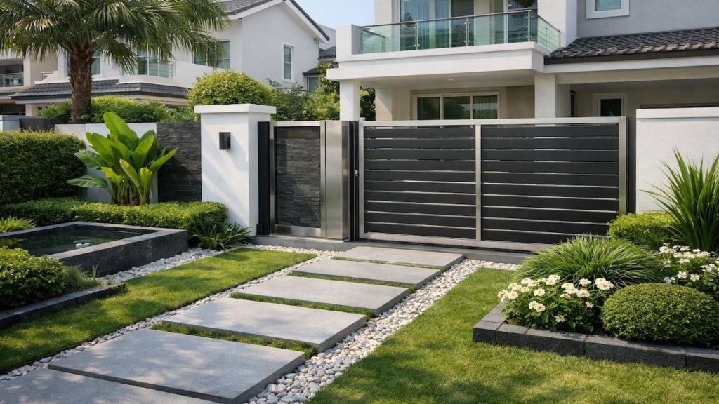
2. Match walls, pots, and greens for balance
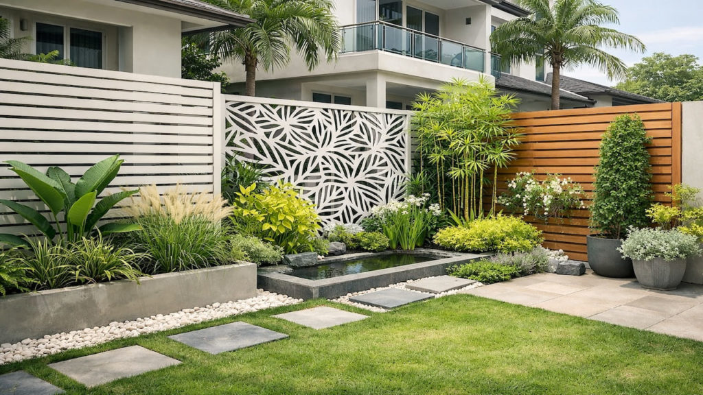
A balanced palette comes from matching undertones not matching exact colors so everything feels related without looking flat.
Walls often lean warm or cool, and Malaysia sun exaggerates that warmth, while shaded corners read cooler—so undertones must agree. Tone harmony. When pots match the wall undertone, greens look richer and less “plastic.” Even cheap pots can look premium if the undertone is right.
- Check if wall reads warm or cool
- Pick pot color one step darker than walls
- Use matte finishes to reduce wet glare
- Choose greens with similar leaf sheen levels
- Match metal accents across lights and furniture
Some people chase exact paint codes, then wonder why it still looks off. The trick is undertone and finish, not perfect matching. Keep one material family, and your garden suddenly looks “planned” instead of “collected.” Easy win.
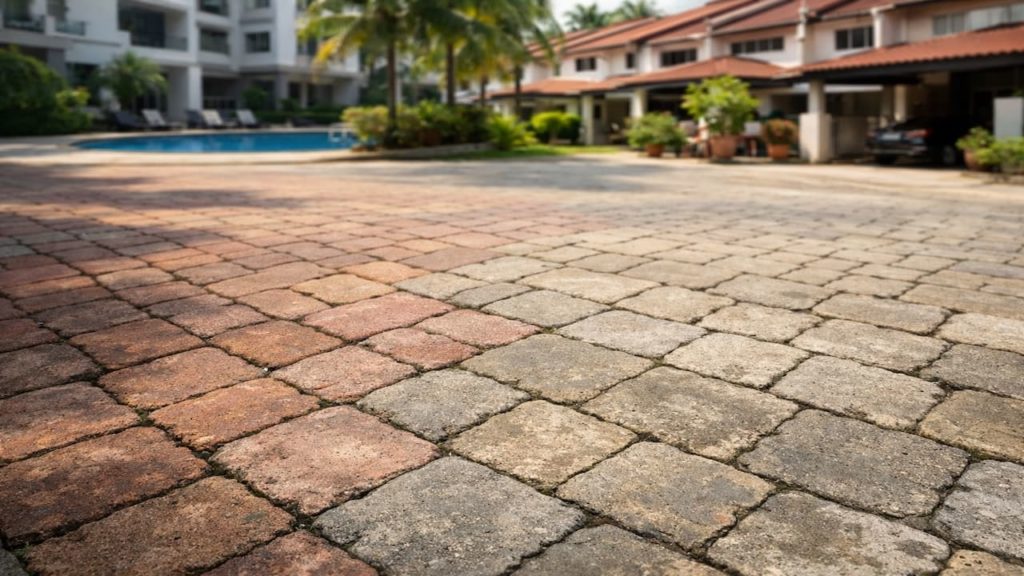
3. Why color plans fail in small Malaysia gardens
Color plans collapse when wet stains and mixed finishes change the palette and your eye loses the anchor.
After rain, algae, splashback, and dust create a new “filter” over everything—your original colors shift. Maintenance reality. Glossy pots reflect light and look noisy, while rough pots trap dirt and look patchy, and mixing both breaks unity. Small yards amplify this effect.
- Wet tiles boost contrast and show streaks
- Glossy pots reflect sun and feel busy
- Rough pots trap dirt and look uneven
- Too many greens blend into one dark mass
- Bright accents multiply when repeated across items
People blame the plant choice, but the real structure is finish and background. If the floor and wall colors fight, no plant can “fix” it. Set the background first, then pick greens that sit on it cleanly. That is design.
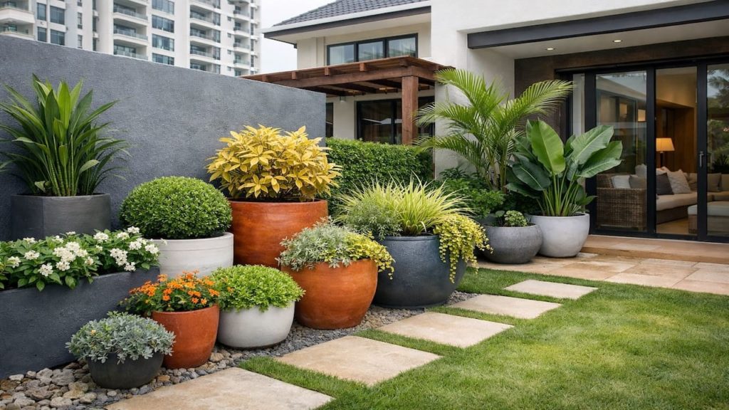
4. How to build a simple color plan that looks premium
Build the palette by locking background first then limiting accents so every new item has a clear rule to follow.
Start with a quick audit using daylight and shade photos, then decide your base neutral, your pot finish, and one accent color—then stop. Decision clarity. If you need supplies, RM5–20 for sample swatches and tape is enough to test without regret. This prevents “wrong beige” and endless re-buying.
- Photograph the space in sun and shade
- Choose one neutral that matches existing walls
- Standardize pots to one finish and color
- Use one accent color on one focal item
- Repeat that accent only two more times
You may think rules limit creativity, but rules create calm and make plants feel richer. Keep accents rare, and your greens look more natural. When something new does not fit the rule, do not buy it. Simple discipline.
5. FAQs
Q1. What is the easiest base color to use?
Use the wall color as your base, because it is already the largest surface in most Malaysia homes. Neutral walls make wet-season stains less visually loud.
Q2. How do I pick pot colors that look expensive?
Choose matte mid-tones that match wall undertones and avoid high-gloss finishes in bright sun. Matte surfaces hide water marks better and feel calmer.
Q3. How many greens should I mix?
Limit to two main green tones, one deep and one fresh, so the planting reads layered instead of muddy. Too many greens can blend into one heavy block.
Q4. Should I match the floor tiles too?
Yes, treat the floor as the background—if it is warm, keep pots warm, and if it is cool, keep pots cool. Quick check. That stops the “clash” feeling immediately.
Q5. What if my walls are already a strong color?
Then make pots and furniture quieter, and let plants provide the variation with leaf texture instead of more color. Strong walls need fewer accents to feel balanced.
Pro’s Tough Talk
Listen, I’ve been on site for 20+ years and done hundreds of jobs, and I’ve seen “color vibes” ruin a good garden faster than broken tiles in Malaysia humidity.
Cause is 3 things: people buy pots like souvenirs, they mix glossy and rough finishes, and they ignore how rain and algae repaint everything overnight. Contractors don’t teach this, but they also get blamed when the space looks messy.
Do this now in 3 steps: pick one base from your wall, standardize pot finish, and limit accents to one focal point. You know that moment you rinse the floor and the pots suddenly look dusty again. You know that moment your plants look fine, but the whole corner still feels “off.”
The structure is cold: if your background and finishes fight, your brain reads clutter no matter how healthy the plants are. Color rules beat shopping every single time. Like wearing a clean uniform, it makes everything look sharper.
And if you add another “cute” pot color for variety, come on, you’re not painting a carnival, you’re building a calm garden.
Summary
A calm premium garden comes from a clear base neutral, one pot finish, and controlled accents that survive Malaysia sun, rain, and humidity. Visual order.
If your space still feels busy, reduce accents and unify finishes before changing plants, because background harmony controls the whole look.
Pick one base color and standardize your pots today—then your greens will look richer, your space will feel bigger, and maintenance will feel lighter.