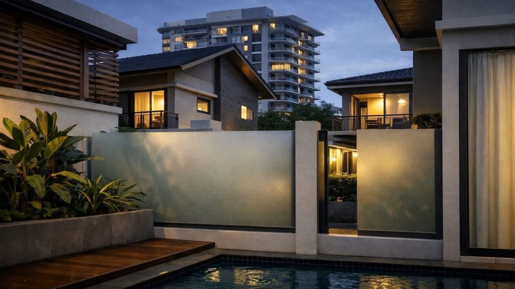
You stare at the paving and the wall and something feels off, even after washing, because the colors never really “talk” to each other. If the wall feels warm but the slabs feel cold, the whole yard looks like two different houses.
In Malaysia, wet months, strong sun, and dusty splash zones can shift how tones read on terrace-house porches, side yards, and condo patios. Humidity also adds a dark wet sheen that makes pale paving suddenly look cheaper.
In this guide, you’ll learn how to link paving and wall tones with simple rules so your yard looks calmer and more expensive without overthinking. You will also know where to use texture so wet shine does not ruin your color choice.
Hi, I’m Ken. I write practical home guides for Malaysia—no fluff, just what works.
I hold a formal building design qualification and have spent about 20 years on job sites across hundreds of projects. My goal is simple: help you avoid costly mistakes with clear, safe steps—a quick way to decide what to do next.
1. Outdoor paving to match walls: 5 tips
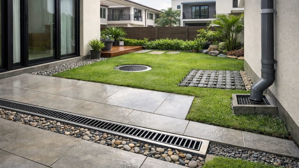
Match undertones first then tune the brightness so paving and walls feel like one design choice, not two separate purchases.
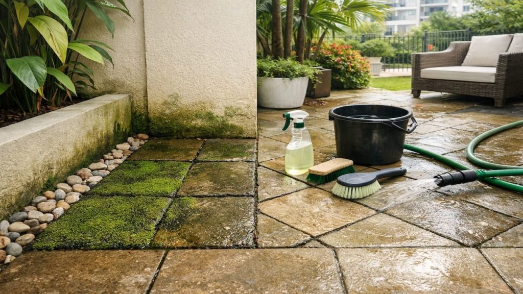
Rain, glare, and damp film change color perception outdoors, so the “same” beige can look pink beside render and green beside painted walls. Undertone control. Use a quick daylight check and a wet-surface check before you commit. A small mismatch gets louder in a narrow Malaysian yard.
- Check wall color in shade and sun
- Wet one paver to reveal undertone shift
- Use one warm tone family across surfaces
- Keep grout color close to paving tone
- Repeat the wall tone in edging pieces
Some people say “contrast looks modern,” and it can if the contrast is controlled and repeated. Random contrast just reads like leftover stock, and algae stains will spotlight the gaps — so decide the plan before you buy. When undertones align, even budget finishes look unified. Better photos too.
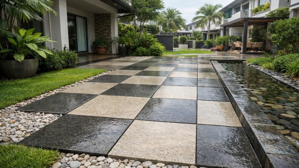
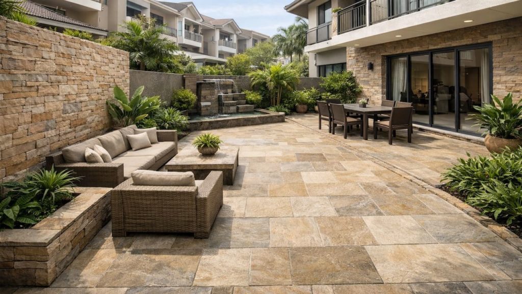
2. Link tones so the whole yard looks unified
Think in three tones only and repeat them across wall, paving, and trim so your eye stops bouncing around.
Most Malaysian homes already have fixed tones: painted walls, gate metal, and roof shadow lines that cut across the porch. The trick is to pick one base tone, one support tone, and one accent tone that survives weather and dirt. Tone budget. If you add a fourth tone, the space starts to look busy fast.
- Choose a base tone from existing walls
- Add a support tone for main paving
- Limit accent tone to borders and steps
- Repeat tones in planters and skirting panels
- Use matte textures to hide wet sheen
You might worry this will look boring, but repetition is what makes small outdoor areas feel premium. A terrace yard is basically a frame around the house — the frame should be quiet. Even cheap pavers look intentional when tones repeat. Save “fun” for plants and lighting.
3. Why undertone clashes make paving look messy
Undertone clashes create a dirty look even when clean because the brain reads the edge between tones as a stain line.
Warm walls beside cool-gray pavers can create a faint green cast in humid light, especially after rain and during overcast afternoons. Then mildew dots, leaf tannins, and rust drips become more visible because the background already feels uneven. Visual noise. This is why some yards look patchy right after a rinse.
- Cool gray pavers fight creamy off-white walls
- Red brick tones amplify yellow stains on grout
- Dark pavers make wall splash marks obvious
- High gloss tiles magnify cloudy water spots
- Mixed batches create stripes across narrow walkways
People blame “bad material,” but most of the time it is a palette mistake, not a strength issue. Yes, dirt exists, and Malaysia gives you plenty of it, but a calm tone plan forgives dirt better — and keeps cleaning effort lower. Less scrubbing. Pick calmer tones and stains stop screaming.
4. How to test a tone match before you commit
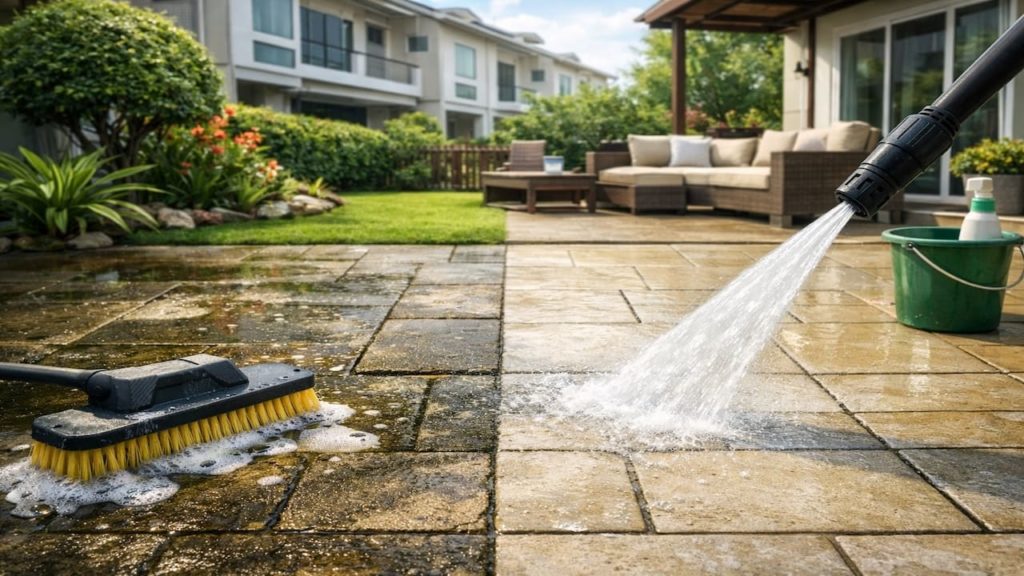
Test with real light and real water because showroom lighting lies and outdoor humidity changes everything.
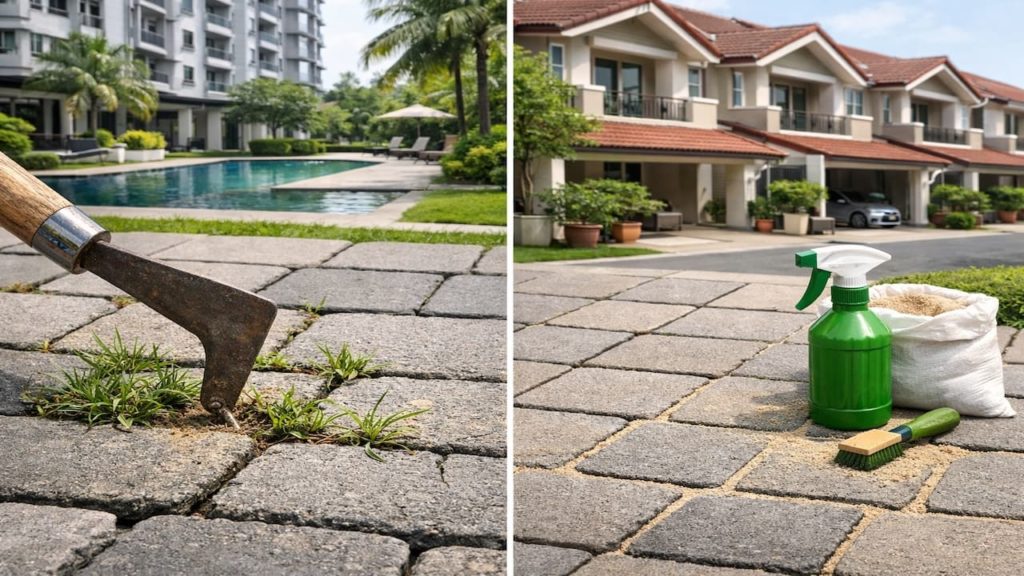
Buy 2 to 3 samples, place them by the wall morning and late afternoon, then splash water and watch the shift. RM5–20 for basic samples. Decision proof. Do this near the gate and near the back, because shadow, grime, and airflow differ by zone in Malaysia.
- Photograph wall and sample under cloudy daylight
- Splash water and compare wet versus dry
- Check beside gate metal and window frames
- Place sample where algae usually forms first
- Choose grout sample and view from standing height
Some folks skip testing to “save time,” then spend weekends scrubbing and regretting it. If you test once, you avoid repainting, re-tiling, or living with that nagging mismatch. Your phone photo will show the truth faster than your memory. One calm hour now beats months of visual annoyance — every time you step outside.
5. FAQs
Q1. Should paving match the wall exactly?
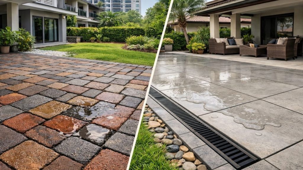
No, exact matching can look flat outdoors. Aim for the same undertone and keep the paving 1 to 2 steps darker to hide splash marks. Exact match also shows every drip line.
Q2. What if my wall color is very warm?
Stay in warm neutrals like sand, taupe, or warm gray rather than blue-gray. In humid Malaysia light — especially on wet days, cool gray can turn greenish beside warm paint.
Q3. Is light paving always better for small yards?
Light paving can brighten narrow terrace spaces, but it shows leaf stains faster. Pick a mid-light tone with texture so it reads clean after rain. Texture helps.
Q4. How do I match paving with stone-look wall tiles?
Read the tile’s dominant undertone first, then echo it in the paving base tone. Consistency beats fancy patterns every time when the area is small.
Q5. Can plants help unify mismatched tones?
Yes, greenery can soften contrast and add a natural buffer line. Use repeated planter colors so the planting looks intentional, not like a cover-up. Plants should support the palette, not hide it.
Pro’s Tough Talk
Listen, I’ve been on site for 20+ years and done hundreds of jobs, and if you half-ass color matching, it will annoy you every single day. After rain, you step out and your mood drops a notch.
There are 3 causes. Walls look like “dry color” while paving shows “wet color,” Malaysia humidity adds a thin film that shifts the tone, and shadow lines scream louder in narrow yards.
Do 3 steps right now. Hold a sheet of white paper to the wall to see the real color, splash water on the paving and watch it while drying, then cut back to a 3-tone rule and ditch the extra colors.
Choosing colors is like cooking blindfolded, and a mismatched yard looks like a patchwork futon after rain Align the undertone first. Once that locks in, even cleaning feels lighter.
That moment you hose it down right before guests and freeze like “why is it blotchy,” and that moment you rush out with laundry and the floor suddenly looks weirdly blue, yeah you know it, so let me say it — is that really your plan. If the wall and floor are fighting, you can scrub all you want and still lose. You gonna call that “unified” with a straight face.
Summary
Undertone and repetition are the core, and they matter more outdoors because Malaysia light and moisture exaggerate small clashes — palette control. Three tones keeps the space calm.
If your yard still feels busy, remove one tone first, then retest with water in your dirtiest zone before changing anything major. Small tests prevent big regret.
Pick three tones and repeat them on purpose then jump to your next related fix like algae control or faster-drying paving.